Branding, graphic design & Visual identity
Duing my three years of study at EK, Erhvervsakademi København, I worked closely with companies in need of modern, creative solutions—ranging from packaging design and user experience (UX) to campaign concepts. I have designed and pitched my ideas to organizations such as Anarkist, Puronia, Cinemateket, and Glyptoteket, among others. Below is a selection of my work
Scroll down to view workCanesten
-
Case and campaign name:
Canesten – Your Body Isn’t a Project to Be Perfected
The Challenge
Canesten is traditionally perceived as a clinical "infection leader"—a cold, medical quick-fix that only appears when something is wrong. In a digital culture where Gen Z is constantly pressured to "optimize" every inch of their existence, intimate health has become a source of shame and a "taboo-show". My challenge was to reposition Canesten from a reactive medical solution to a holistic female health expert.
OBS: The images were created based on Pinterest photos with the help of AI to stage the product in the aesthetic settings we envisioned.
-
Through research, I identified an "Information Gap." While 58% of 16-24-year-olds use social media as their primary source of knowledge, these same platforms fuel body insecurity through polished, digital ideals. The insight was clear: when we treat a natural body as a project to be optimized, shame is inevitably created
-
I developed a non-product pull strategy centered on education rather than direct sales. By establishing an educational ecosystem on Meta and a dedicated learning platform, we "pull" the audience in by offering value, empathy, and truth.
The Proposition: "Your body isn’t a project to be perfected—it just needs to be understood".
Storydoing: We moved beyond storytelling by partnering with the NGO Sex & Samfund to provide legitimate, shame-free education.
Visual Language: Collaborating with pioneer Ashley Armitage, we utilized a nonchalant, "System 1" visual style to lower audience defenses and normalize the natural body.
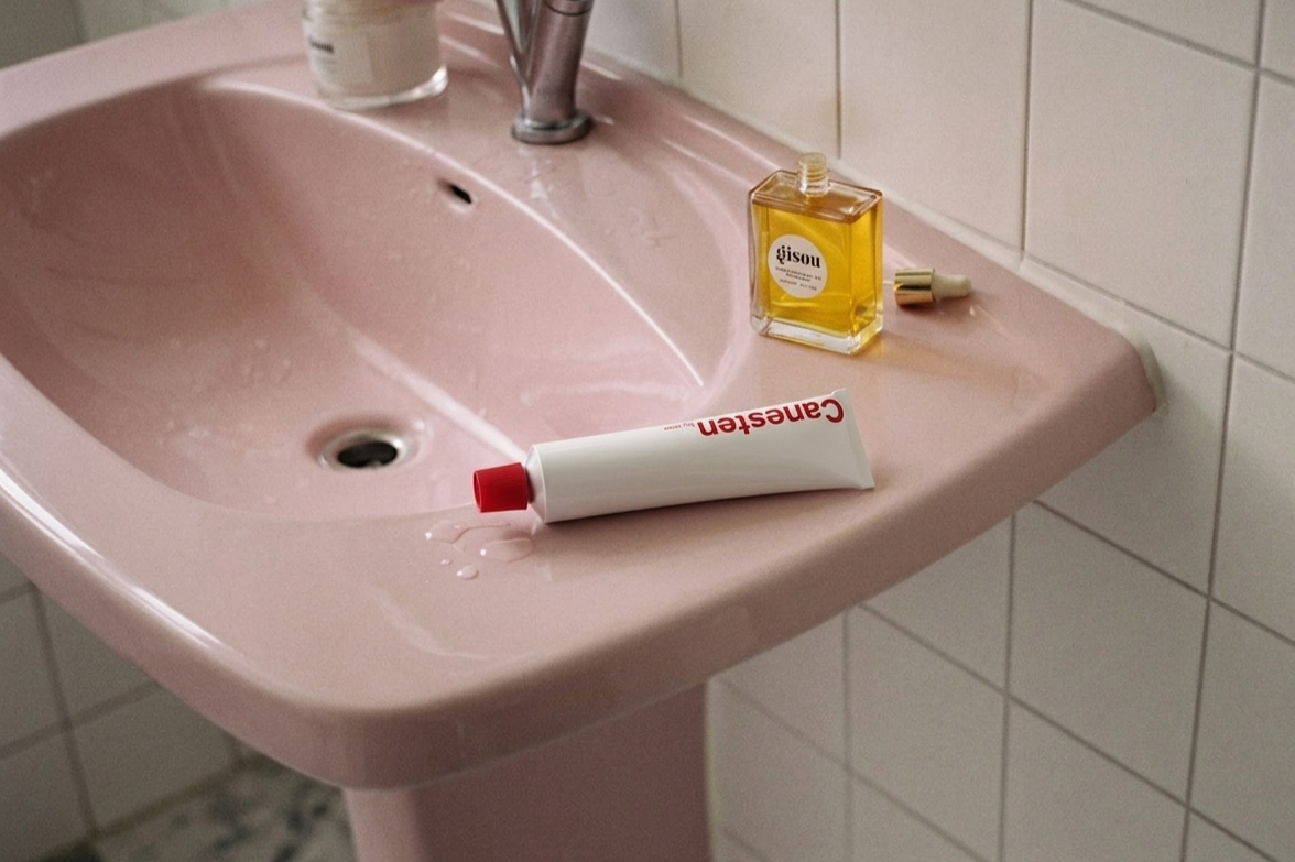
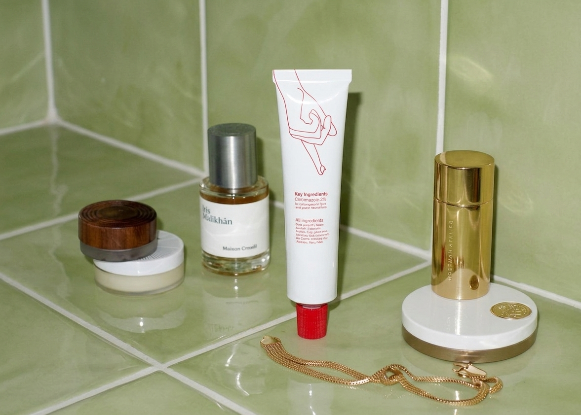
Canesten products not just as medical fixes, but as an essential part of a "shameless self-care". By merging scientific credibility with genuine empathy, the campaign shifts the perception of intimate care from an embarrassing problem to a way of honoring and supporting one's own body.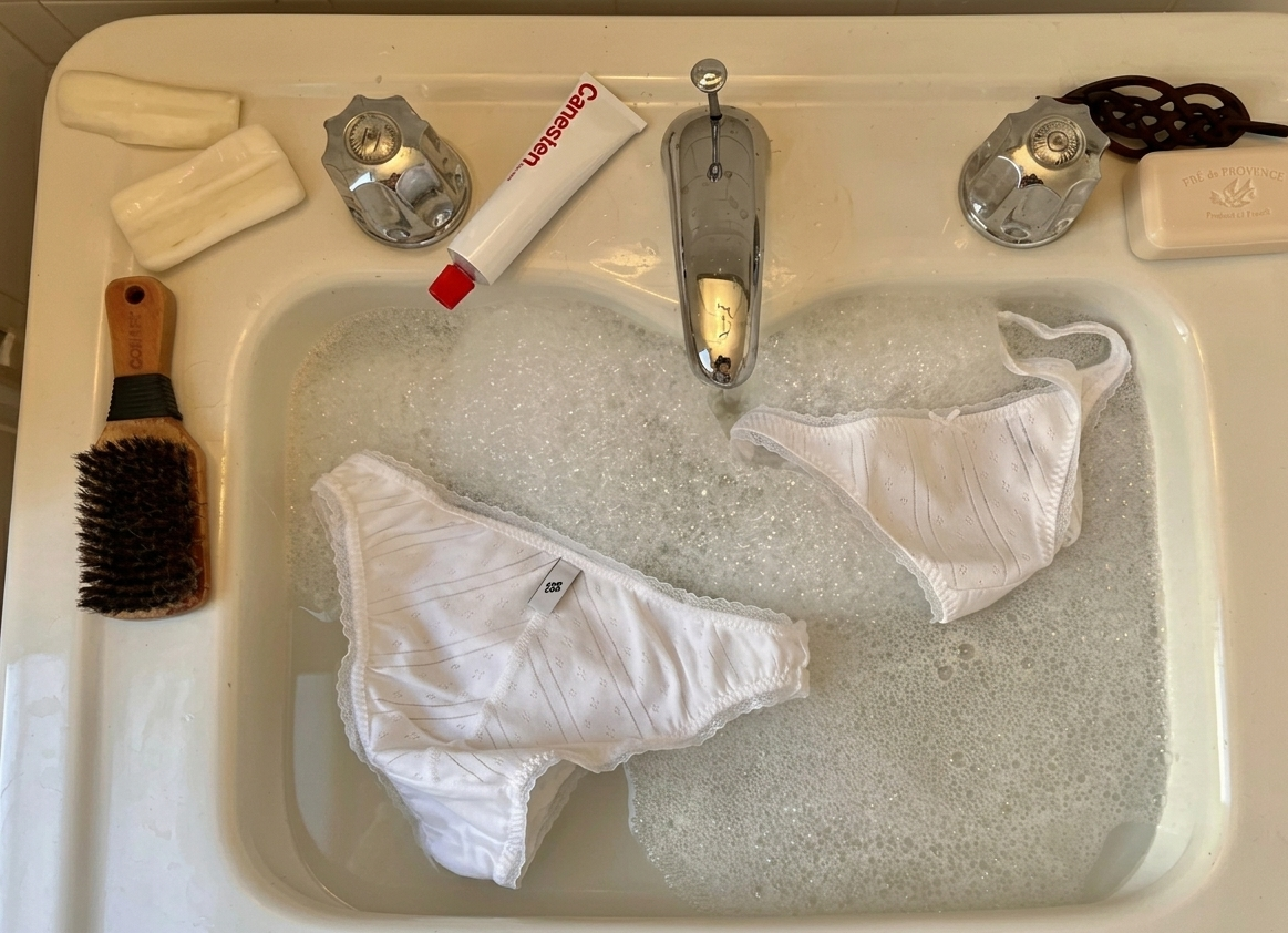
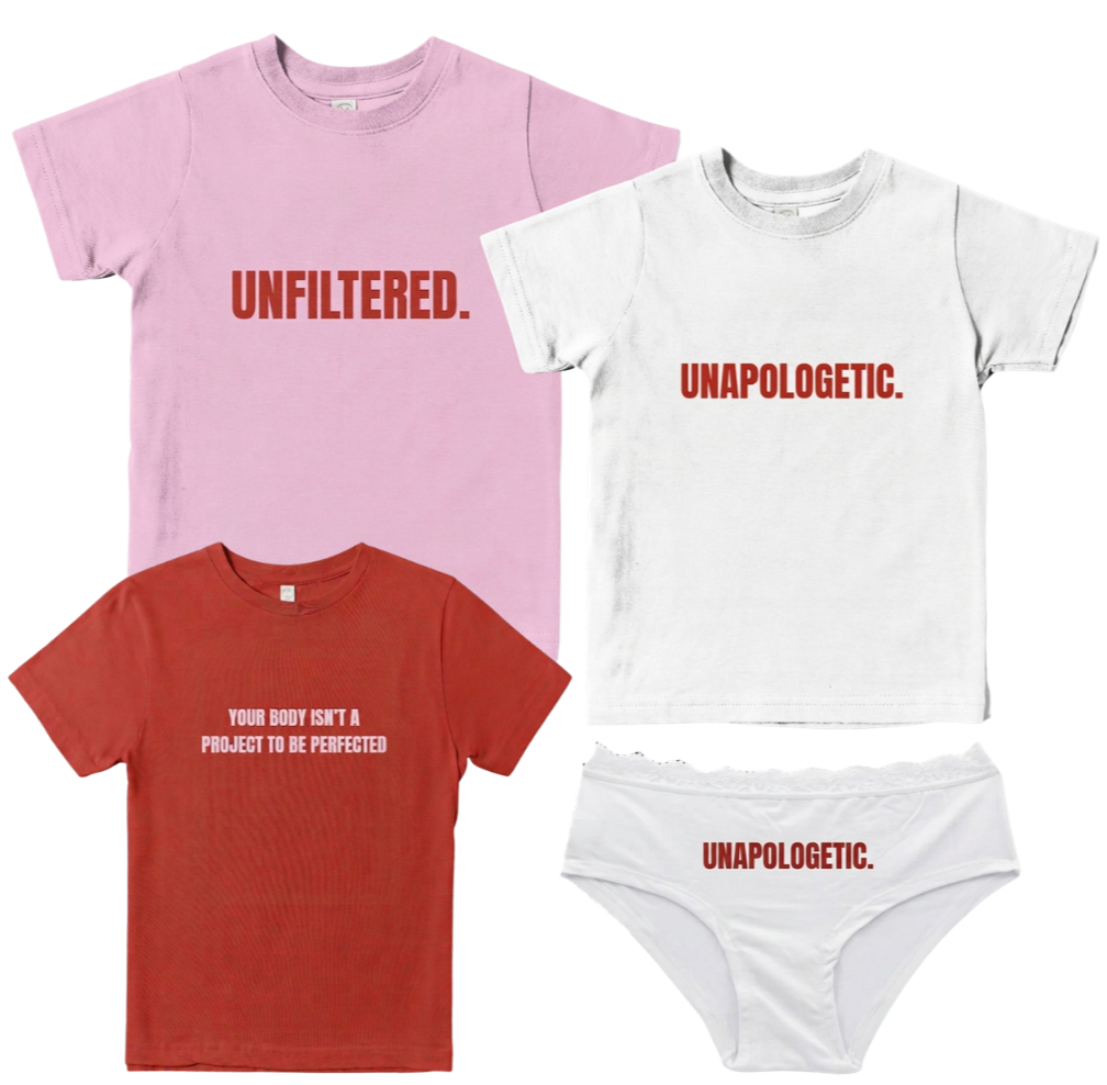
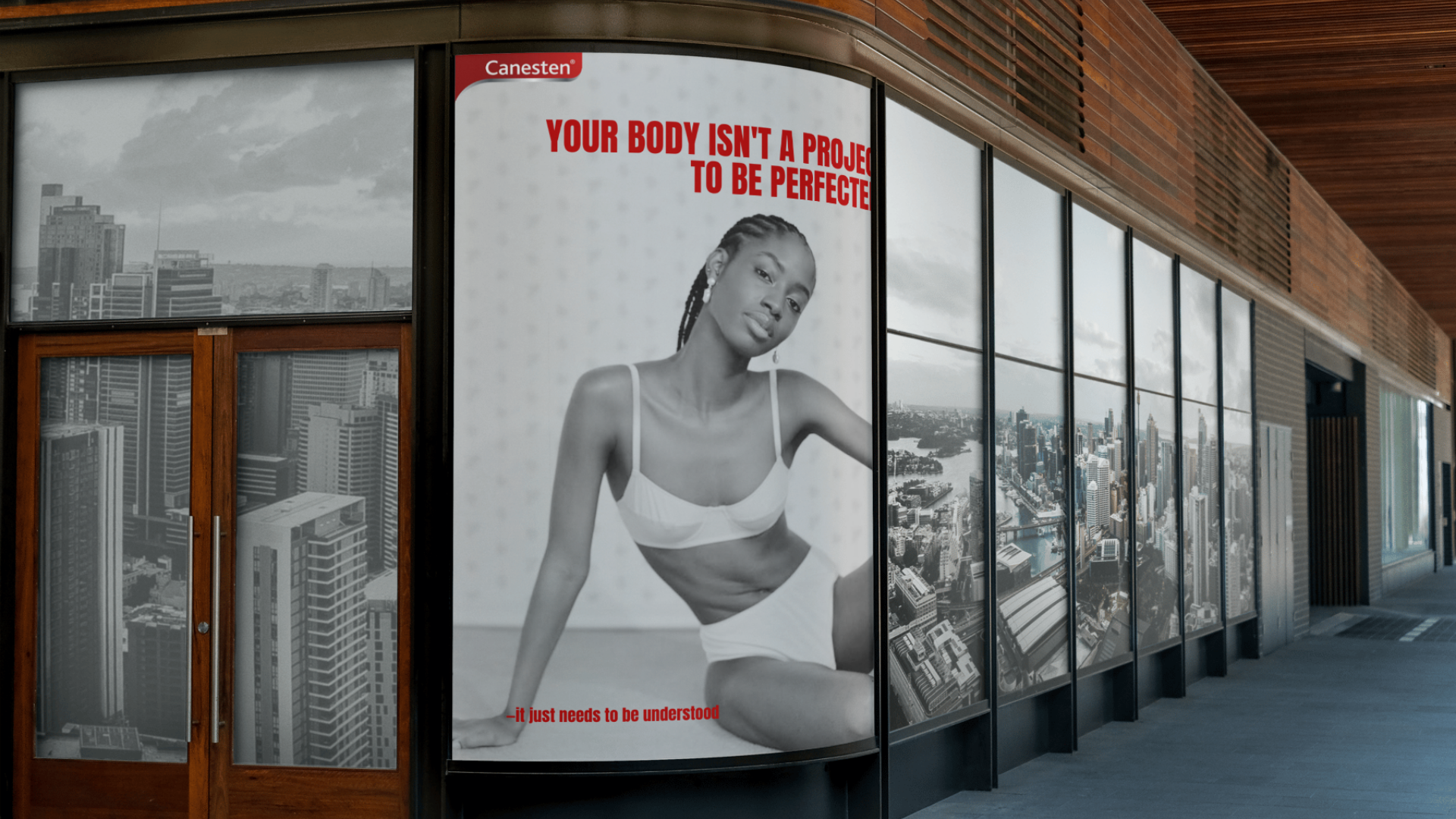
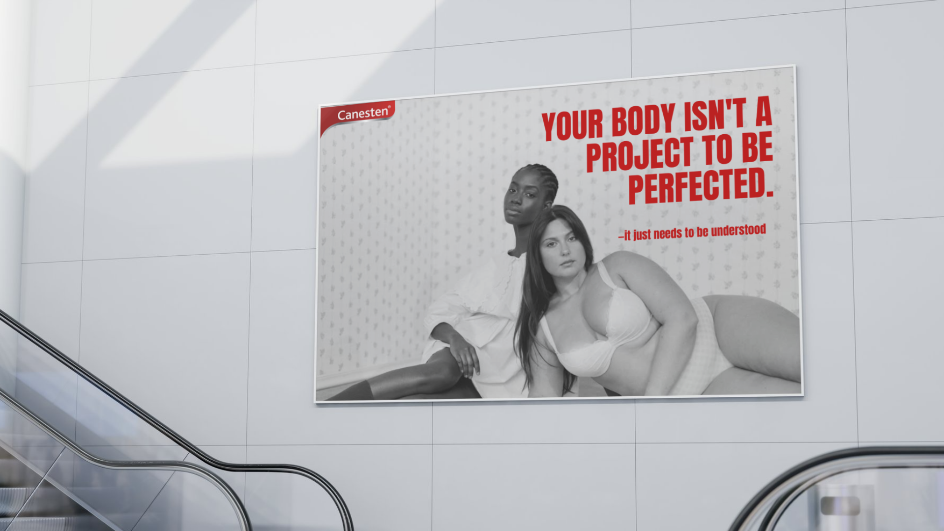
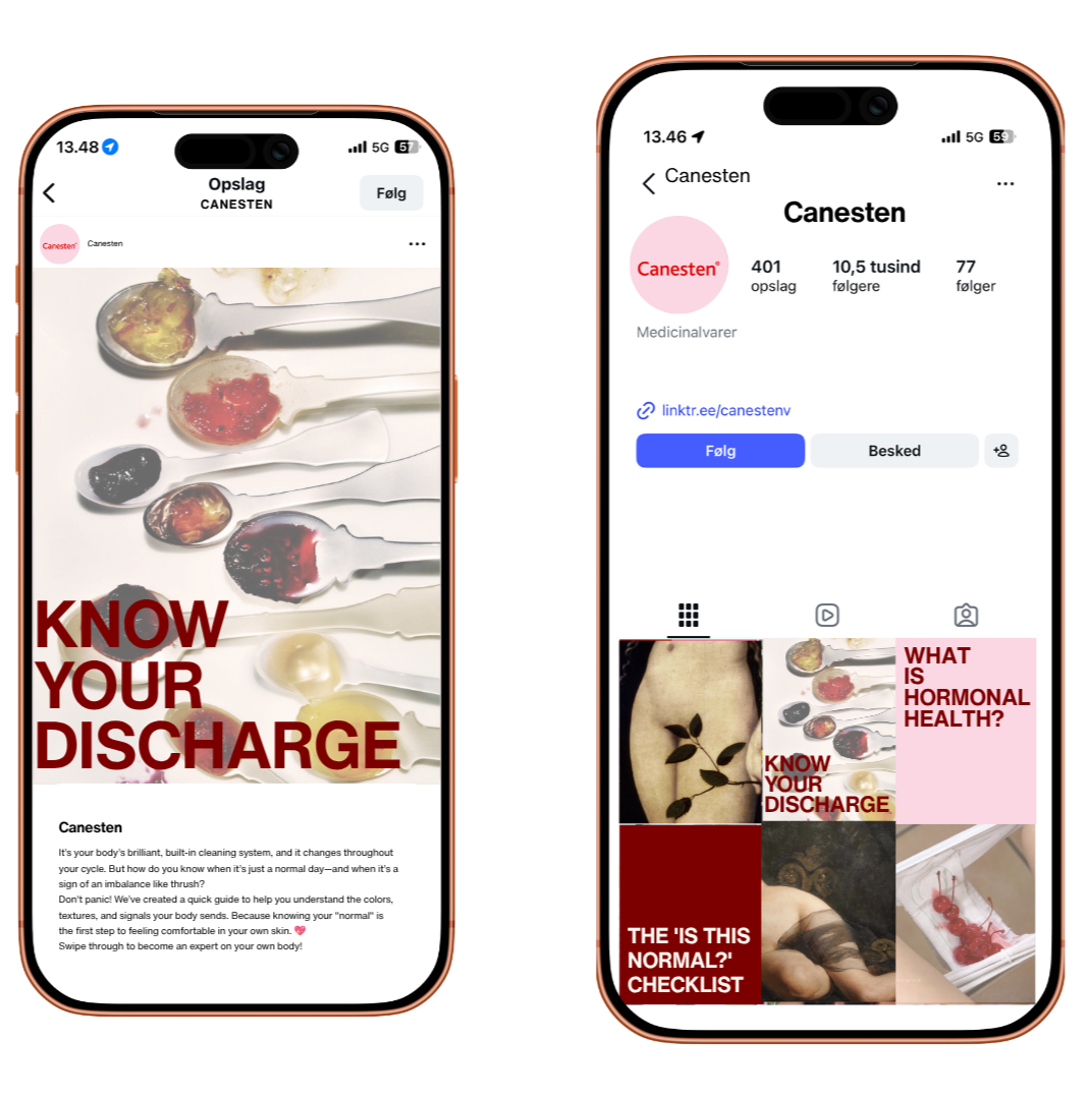
Mockup example of collab between photographer and creative director Ashley Amitage: content and campaign video with focus on diversity and for Canesten SoMe to become an eductaion page most.
Some mockups
Project: Repairo
– Designing for the Circular Economy
-
During the "Design, Business & Technology" module, the challenge was to develop a "New Circular Business" concept. The objective was to move beyond traditional ideation and strictly validate our concept. This meant we had to prove actual market demand through "pretotyping" and gather our own real-world data, by testing user behavior before building any actual technology. Furthermore, the concept had to be financially viable and grounded in a solid business model
-
We conceptualized Repairo, a two-sided booking platform designed to seamlessly match everyday cyclists with local bicycle repair shops in Copenhagen (Nørrebro). Our research showed that while consumers want to act circularly by repairing their goods, they are hindered by price opacity, search friction, and a lack of trust. Repairo solves this by offering standardized pricing, direct booking with escrow payments, and transparent ratings. Ultimately, the platform aims to extend the lifespan of products and prevent unnecessary waste, tapping into the "Resale & Circular Services" approach
-
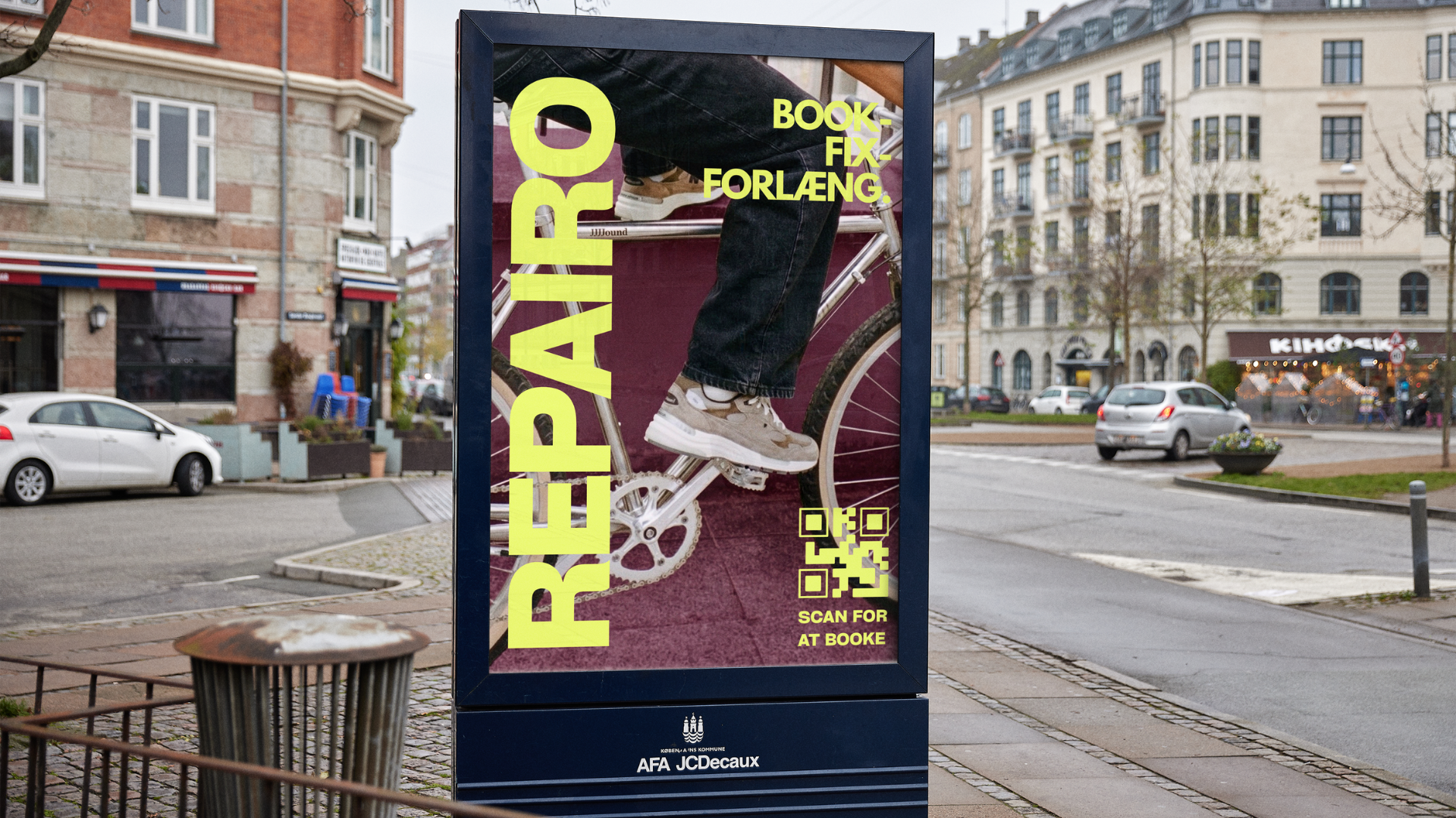
To validate the market demand without coding a fully functional app, we utilized a "Fake Door" pretotyping strategy (a Lean Startup validation method). My primary focus was creating the visual and communicative foundation that made this validation possible. I designed:
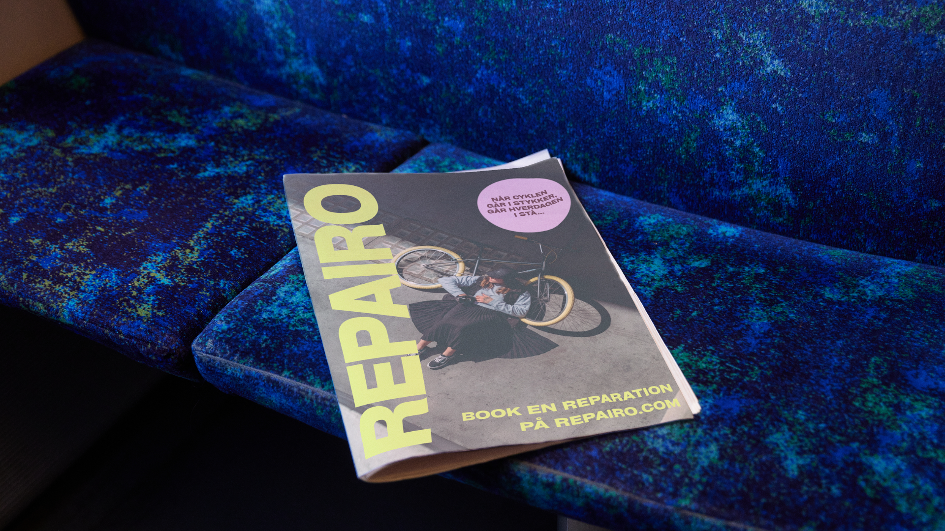
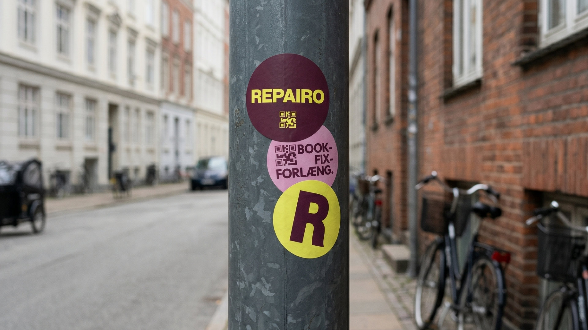
Visual Identity & Tone of Voice: A clean, relatable, and action-oriented brand identity that effectively communicated convenience and trust to our target demographic.
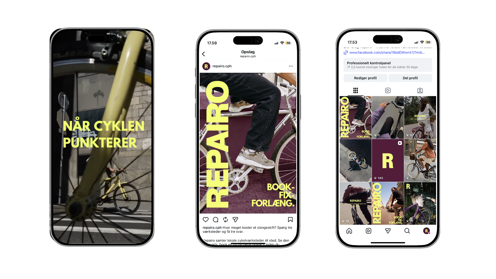
Social Media Campaigns: I designed the Meta Ads (Instagram and Facebook) that served as our "Fake Door". These ads were the crucial touchpoints that convinced users the service actually existed.
Digital & Outdoor Mockups: I developed mockups for outdoor media and the visual facade of our digital platform to test engagement across different touchpoints
Project: Puronia
– Visual identity and campaign strategy
-
The original brand, Puronia, lacked a strong narrative that consumers could emotionally invest in. The sports gel market is heavily saturated with masculine, performance-driven brands that often feel impersonal. Additionally, there is a growing consumer skepticism regarding "zero sugar" claims and the use of synthetic additives and E-numbers in sports nutrition.
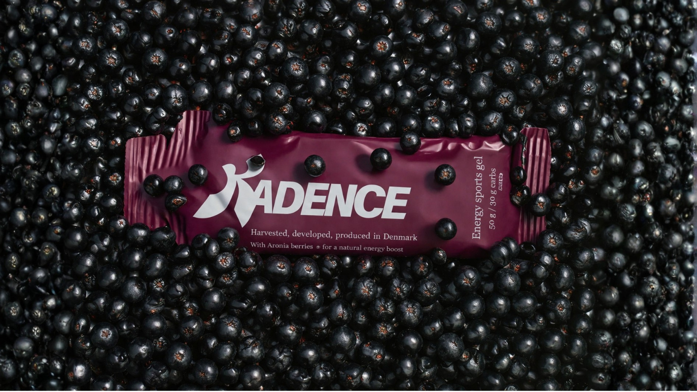
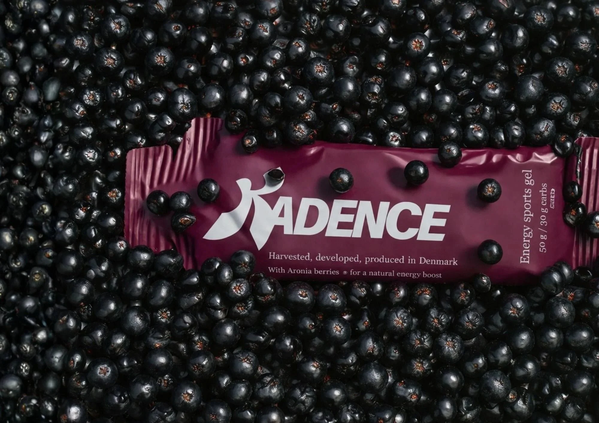
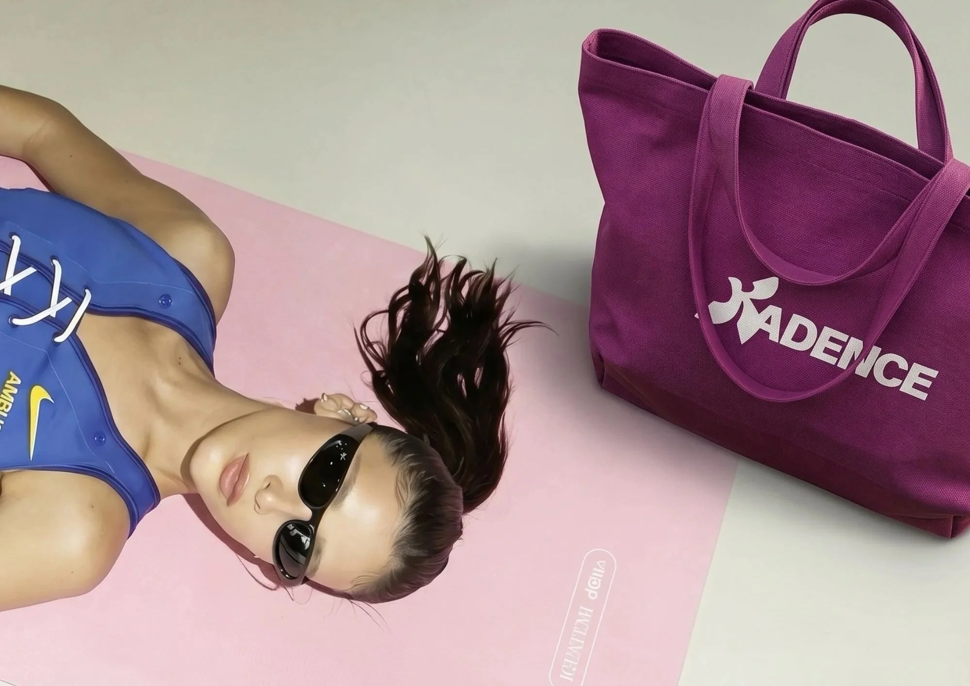
To solve these challenges, I initiated a complete rebranding to Kadence—a name that resonates in both Danish and English and represents your personal rhythm, flow, and pulse.
-
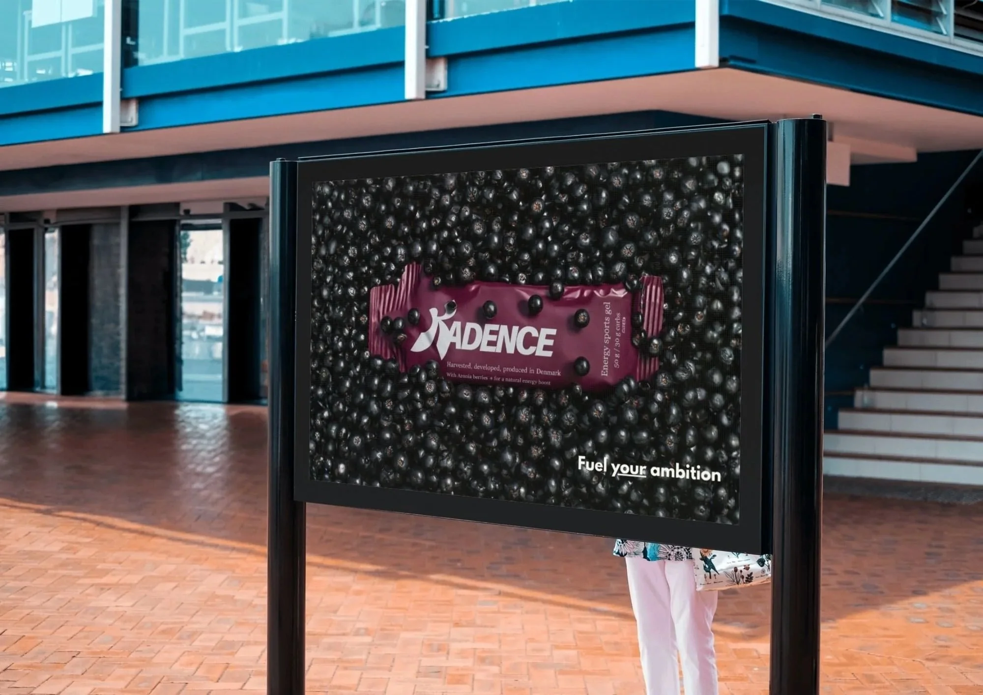
A clean, Danish-produced aesthetic that highlights its natural origins: "Harvested, developed, and produced in Denmark.
-
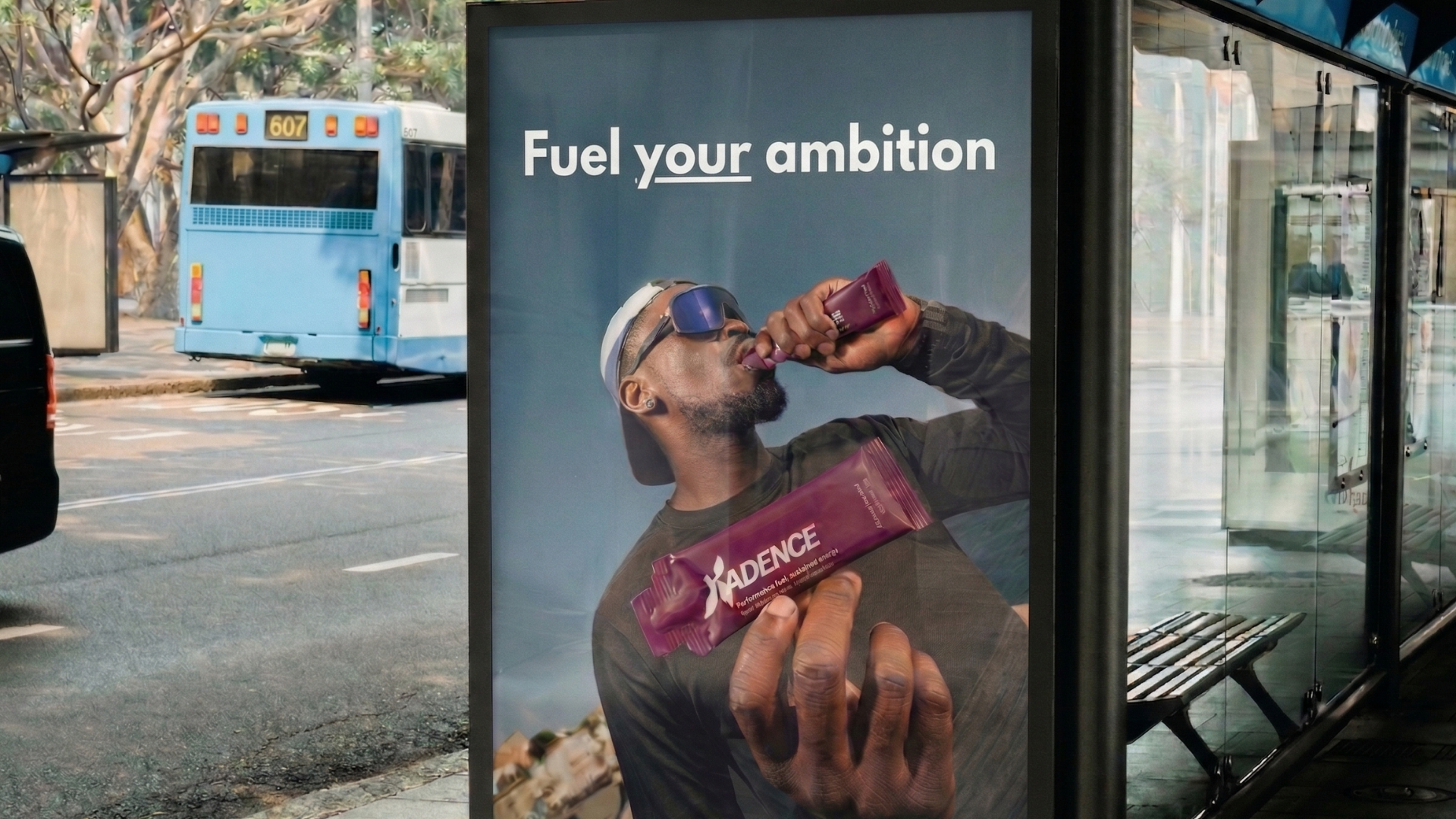
Campaign Strategy: "Fuel Your Ambition"
The camaign addresses a specific human problem: many athletes buy sports products to improve their health, but unintentionally consume chemicals and synthetic sweeteners that contradict their well-being.
Concept: "Fuel your ambition" (alongside "Fuel your potential/progress/intention").
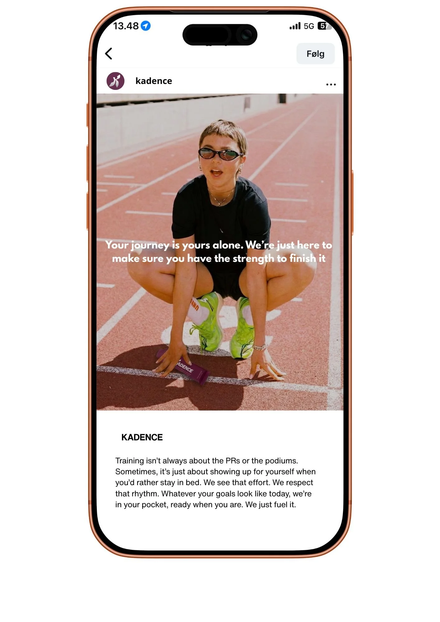
Tone of Voice: Supportive and empowering. We don't tell you what to do; we provide the foundation for you to do it your way. The core message is: "Your journey is yours alone, we are just here to make sure you have the strength to finish it".
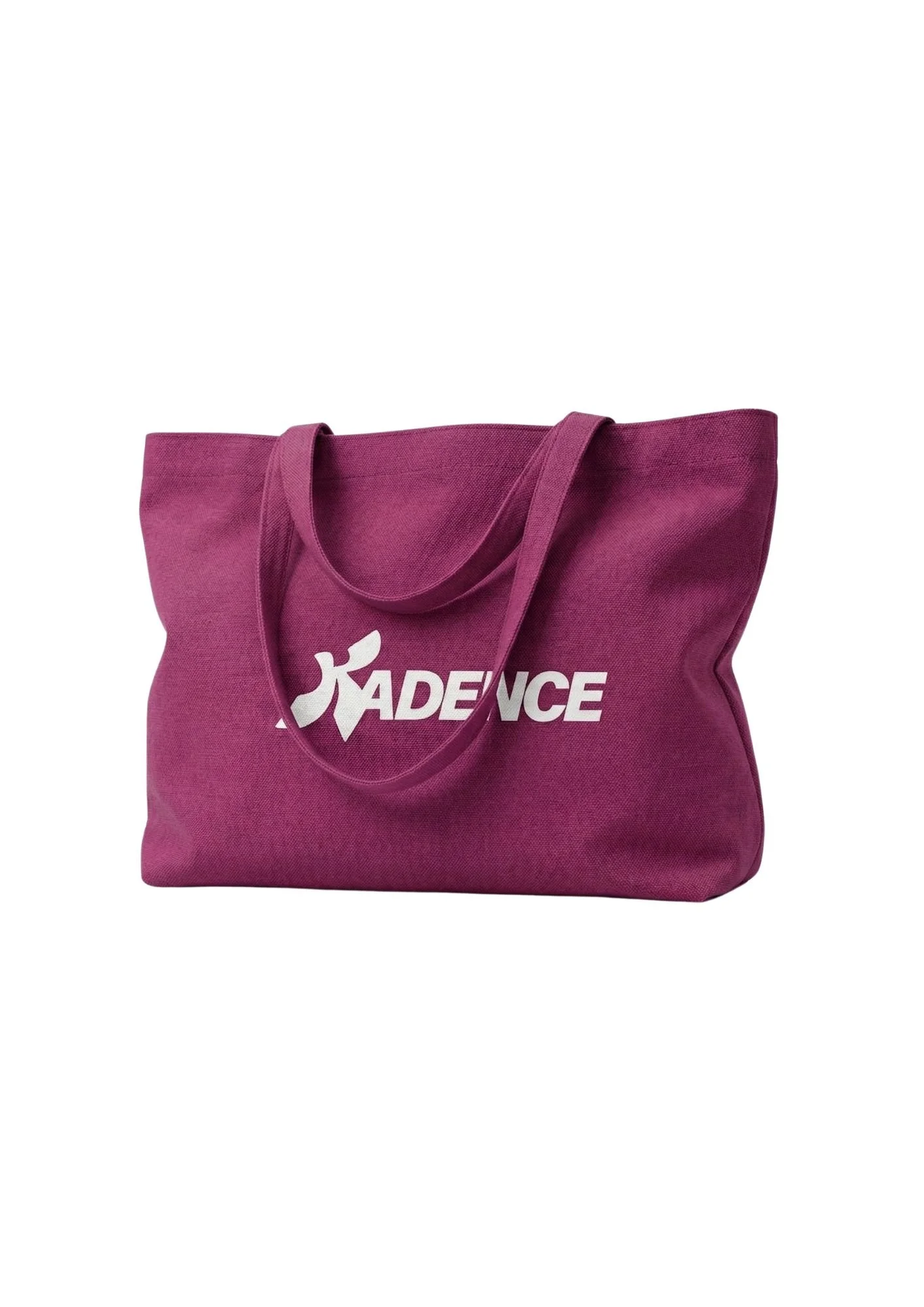
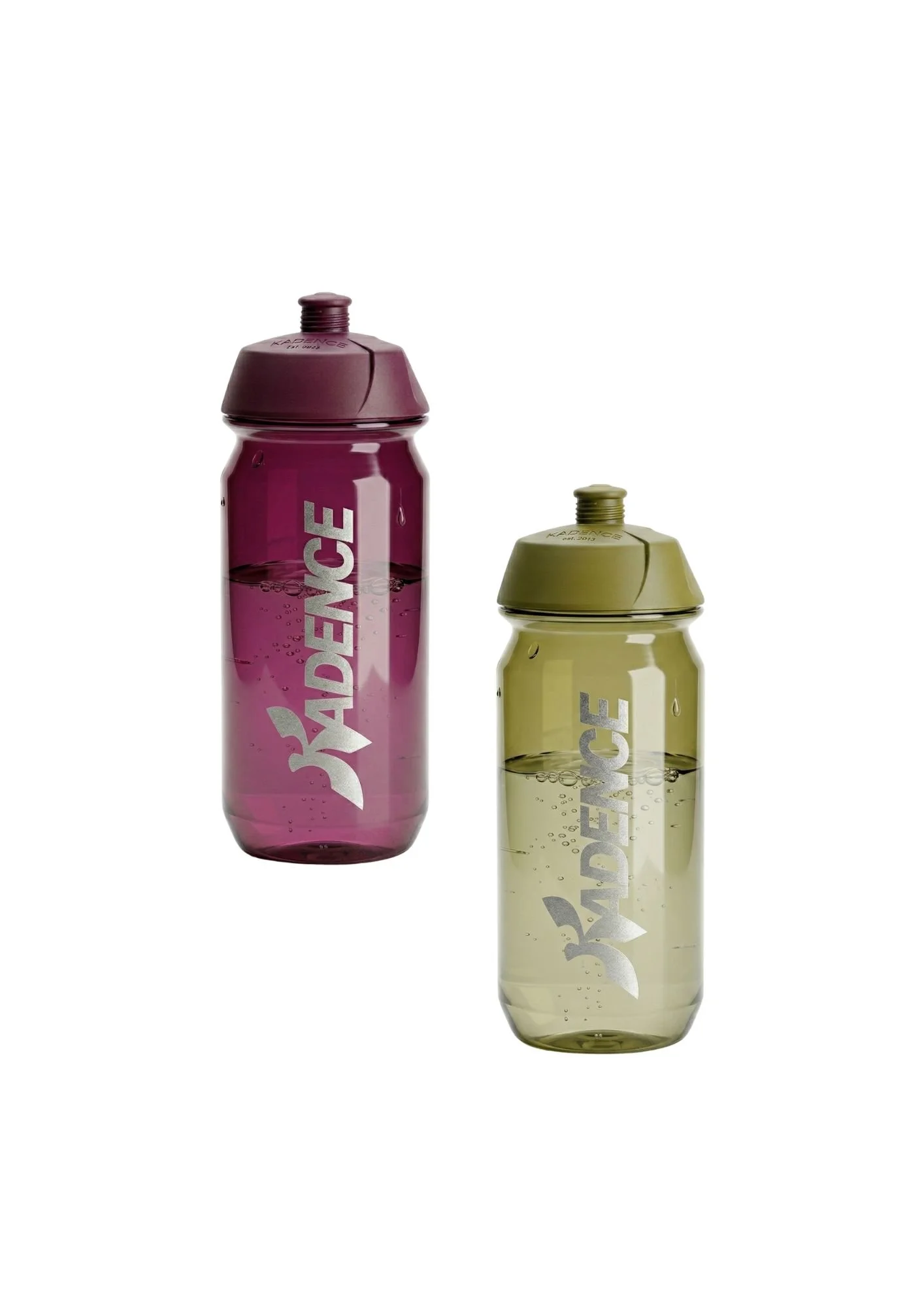
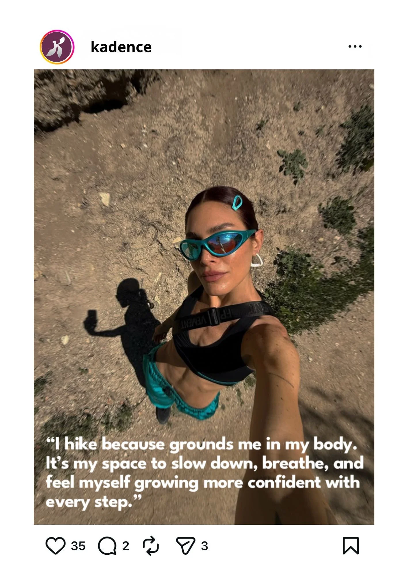
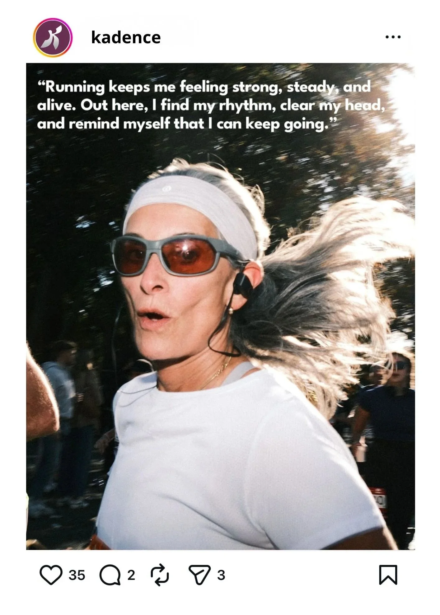
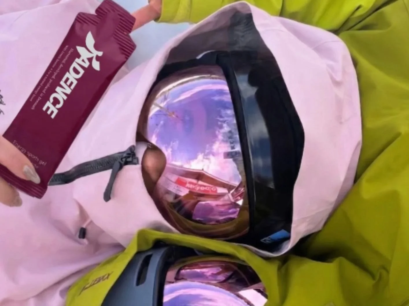
Execution: A multi-channel rollout including outdoor media, social media storytelling featuring real people (hikers, runners, climbers), and brand merchandise like water bottles and tote bags.